ActionSheetUI
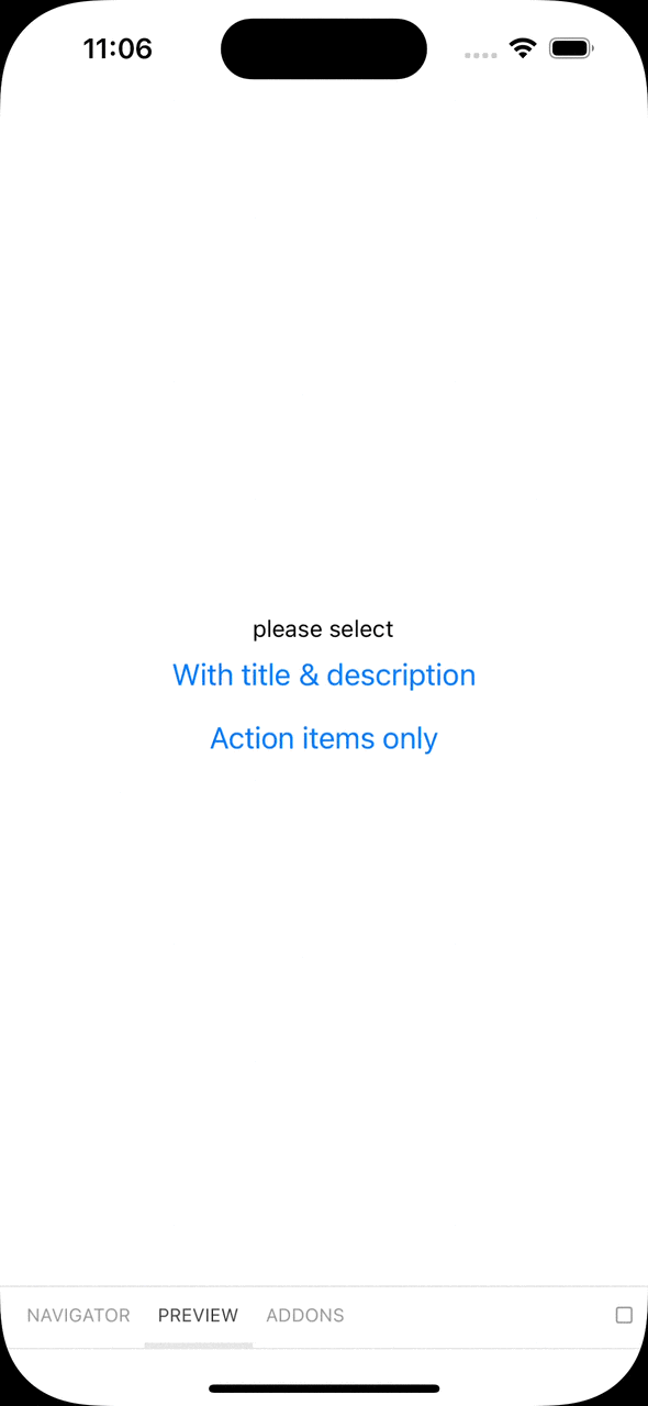
Overview
API Usage
Step 1. create popup
Using Default
ActionSheet.tsx
import { ActionSheetUI, createPopup } from 'react-native-global-components';
export default createPopup(ActionSheetUI);
or you can override default props
ActionSheet.tsx
import {
  ActionSheetUI,
  ActionSheetProps,
  createPopup,
} from 'react-native-global-components';

const styles: ActionSheetProps['styles'] = StyleSheet.create({
  // override default styles
});

export default createPopup((props: ActionSheetProps) => (
  <ActionSheetUI {...props} styles={styles} />
));
Step 2. register portal
App.tsx
const App = () => {
  return (
    <NavigationContainer>
      <RootNavigator />
      <ActionSheet.Portal />
    </NavigationContainer>
  );
};
Step 3. use anywhere
ActionSheet.show({
  actions: [
    {
      text: 'Action Item 1',
      color: 'purple',
    },
    {
      text: 'Action Item 2',
      color: 'green',
    },
  ],
});
Props
title
title text to show
| Type | Default | Required |
|---|---|---|
| string | undefined | NO |
description
description text to show
| Type | Default | Required |
|---|---|---|
| string | undefined | NO |
actions
actions to show. use ReactElement to customize item UI. see interface below
| Type | Default | Required |
|---|---|---|
| (ActionSheetActionItem | ReactElement)[] | undefined | YES |
interface ActionSheetActionItem {
  text: string;
  color?: string;
  onPress?: (text: string) => void;
  style?: StyleProp<TextStyle>;
  testID?: string;
}
cancelAction
cancel button at bottom of action sheet. use ReactElement to customize item UI
| Type | Default | Required |
|---|---|---|
| (ActionSheetActionItem | ReactElement) | { text: 'Cancel' } | NO |
itemHeight
height of action item
| Type | Default | Required |
|---|---|---|
| number | 54 | NO |
headerHeight
height of header content area with title & description text. use Styles.header props below to edit styles.
default 80px if title or description props exists, unless 0px.
| Type | Default | Required |
|---|---|---|
| number | 80 or 0 | NO |
cancelText
text of cancel button
| Type | Default | Required |
|---|---|---|
| string | 'Cancel' | NO |
hideOnPressOverlay
dismissable on press dim overlay
| Type | Default | Required |
|---|---|---|
| boolean | true | NO |
animation
custom withTimingConfig of ActionSheet sliding animation
| Type | Default | Required |
|---|---|---|
| WithTimingConfig | { duration: 300,easing: Easing.bezier(0.25, 0.1, 0.25, 1) } | NO |
gap
gap between action item group and cancel button.
| Type | Default | Required |
|---|---|---|
| number | 8 | NO |
bottomInset
absolute bottom position of ActionSheet
| Type | Default | Required |
|---|---|---|
| number | 0 | NO |
touchableOpacityProps
touchableOpacity props on action button to override default settings
| Type | Default | Required |
|---|---|---|
| TouchableOpacityProps | undefined | NO |
styles
style object to override default style
| Type | Default | Required |
|---|---|---|
| Styles | undefined | NO |
interface Styles {
  title?: StyleProp<TextStyle>;
  description?: StyleProp<TextStyle>;
  header?: StyleProp<ViewStyle>;
  actionGroup?: StyleProp<ViewStyle>;
  action?: StyleProp<ViewStyle>;
  cancelAction?: StyleProp<ViewStyle>;
  container?: StyleProp<ViewStyle>;
  divider?: StyleProp<ViewStyle>;
}